In this instance, I’d like to discuss regression model evaluation. We typically use metrics like MAE, MSE, MAPE, and RMSE to evaluate models. There’s nothing wrong with that, but these metrics can’t provide a detailed evaluation of the model and because this metric use ‘mean’ as aggregation method, it can easily biased (by outliers or by anomalies). it’s important to complement these metrics with other evaluation techniques, like residual plots, to get a more comprehensive and nuanced understanding of how well the model is performing.
Let’s assume that we build a polynomial regression model with a degree of freedom of 2, and we are attempting to evaluate this model on test data. The results obtained are as follows:
R² = 88.8%
Mae = 396.735
Mape = 17.9%
Rmse = 591.20
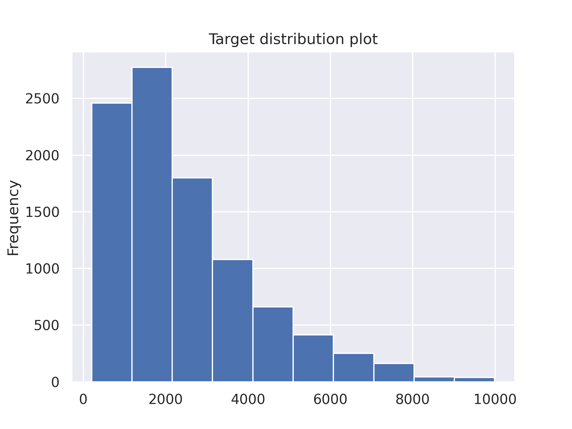
And the distribution of the ground truth values for y is:

Based on the above-mentioned evaluation metrics, an R² value of 88.8% is considered good. The values for MAE and MAPE are also relatively favorable. However, the slightly high RMSE indicates that there are some large residual values, which are influencing the RMSE.
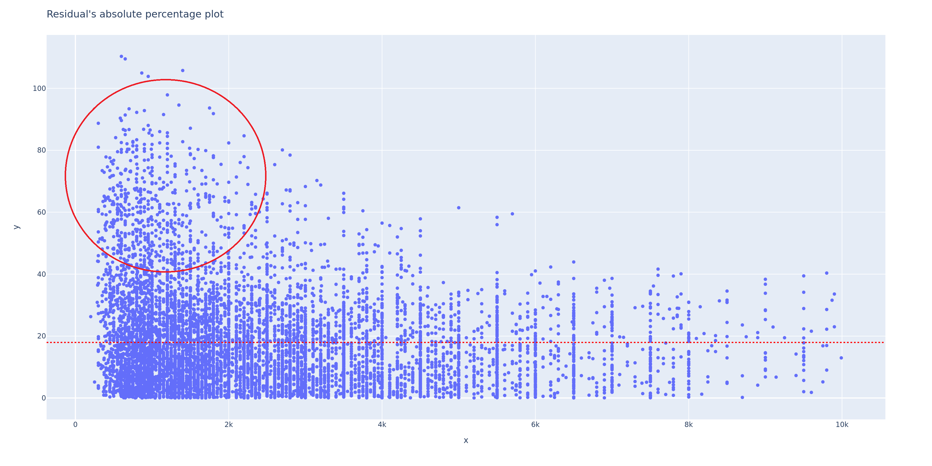
Now, let’s create a residual absolute percentage plot. The y-axis represents the absolute percentage error (error based on percentage), and the x-axis represents the ground truth values.

From the plot above, you can see that there is a significant percentage error, but this error is only present for x < 4k, with the majority of it occurring for x < 2k. This suggests the presence of data anomalies but further investigation is needed to make sure it is really anomaly.
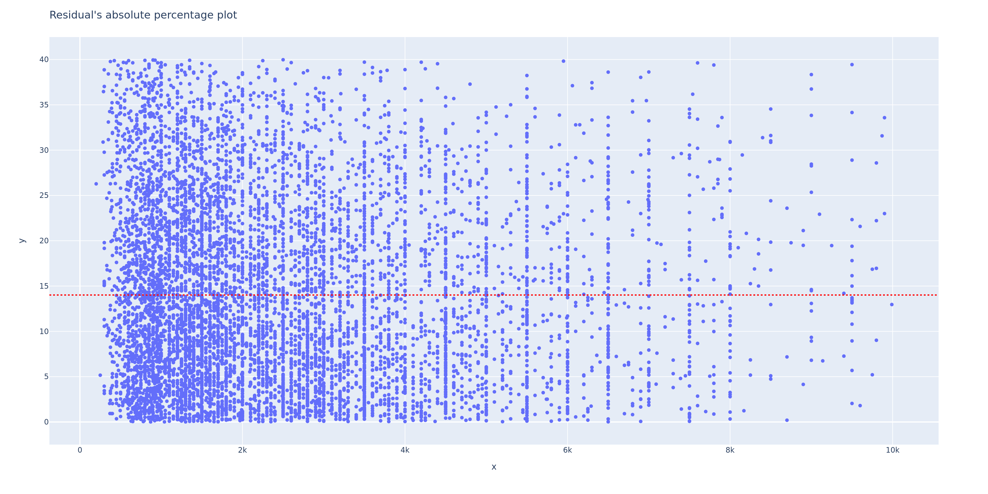
Now, let’s zoom in on the plot up to a 40% percentage error limit.

Based on the plot above, the calculation of the error frequencies is as follows:
0 - 5% = 22.8% of data
5 - 10% = 20.13% of data
10 - 15% = 16.19% of data
15 - 20% = 13.14% of data
20 - 30% = 18.65% of data
30 - 40% = 9.01% of data
Now, the main question is, what is the maximum acceptable percentage error limit? The answer to this question depends on each specific case. Let’s assume that the maximum acceptable error limit is below 15%. This means that the model can only meet our expectations to the extent of 59.12% (22.8% + 20.13% + 16.19%), while the remaining 41% represents predictions with errors exceeding 15%. In my opinion, using evaluation methods like this is better than solely relying on MAPE.
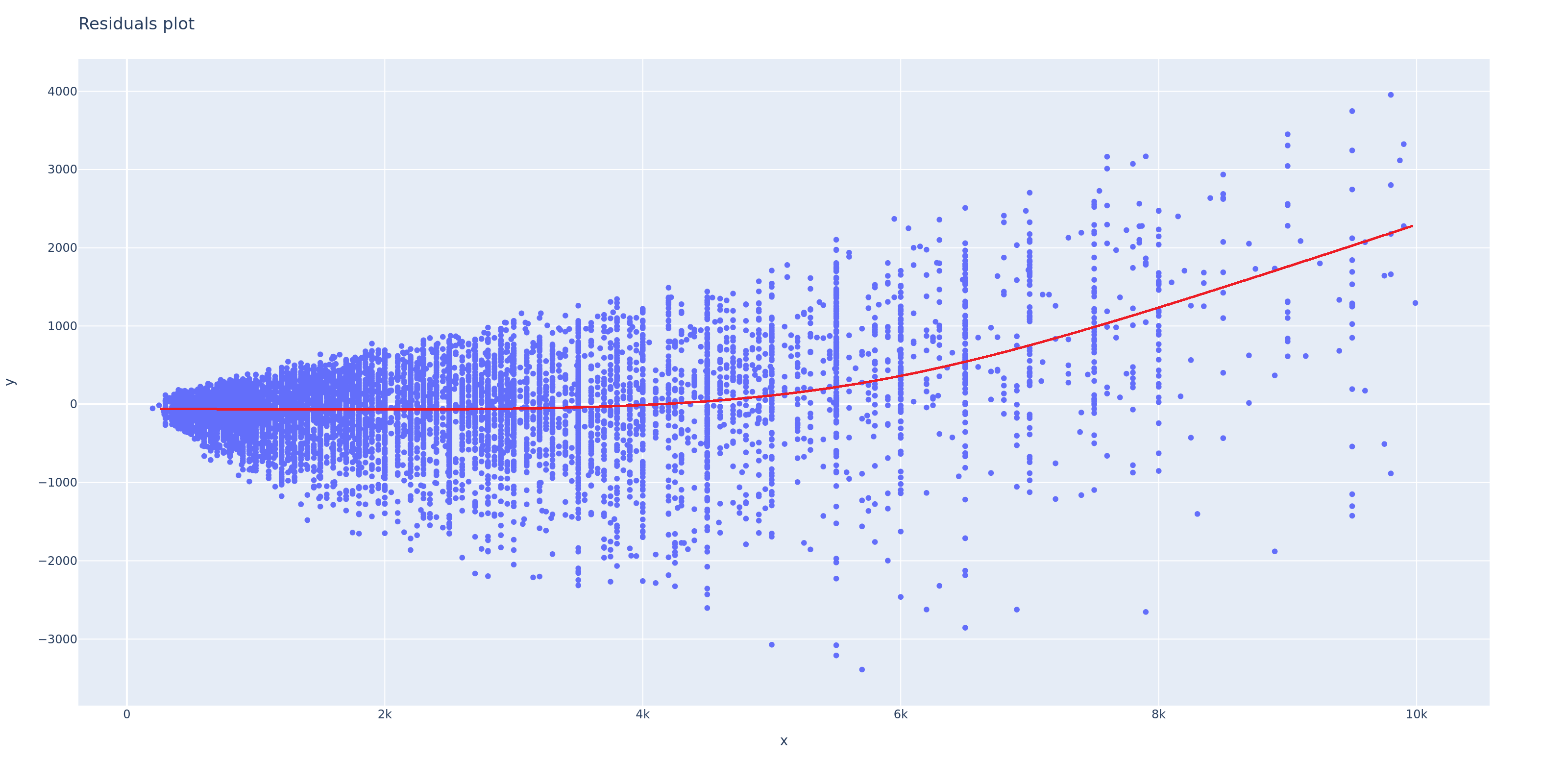
Next, let’s evaluate the residual plot using the actual residual values.

By looking at the plot above, we can see that the residuals have unequal variance (heteroscedasticity). Additionally, there is a pattern where, as x increases, the model becomes more consistent in underpredicting (as indicated by the red line). These two signs indicate that the model is not performing well.
The example I provided above is a simple illustration of how a residual plot can help us to do better model evaluation. Thanks and have a good day!